Crackerjack is a corporate identity for a graphic design firm inspired by my strengths as a designer. Crackerjack is also a self promotional to showcase my strengths as a designer, illustrator and photographer.
The concept for this corporate identity is based on the saying that the difference is in the detail. The name crackerjack means “exceptionally good”. As a designer I am very diligent about detail, layout, composition, hierarchy and the overall look and feel. The main strength I focused on throughout this corporate identity was detail. The look and feel is very formal, soft and icon based.
The concept for this corporate identity is based on the saying that the difference is in the detail. The name crackerjack means “exceptionally good”. As a designer I am very diligent about detail, layout, composition, hierarchy and the overall look and feel. The main strength I focused on throughout this corporate identity was detail. The look and feel is very formal, soft and icon based.
The corporate identity consist out of : business cards, letterhead, quotation form, fax form, data sheet, personal folder, CD sleeve for digital portfolio, envelope, gift bag and door hanger which doubles up as packaging for a magnifying glass to view the icon poster with for detail.
The logo’s first section represents an open chain. This symbolizes that I am open for suggestion and willing to learn more to widen my creative skill set. The two letters:“A”, has been adapted to form two pencil tips to represent me as a illustrator. The slogan, Diligent about detail, best describes me as a designer.
Logo

Datasheet

Fax Form

Quotation Form

Letterhead

Folder pages:
Table of contents

Introduction

Curricullum Vitae

Graphic Design Infographic
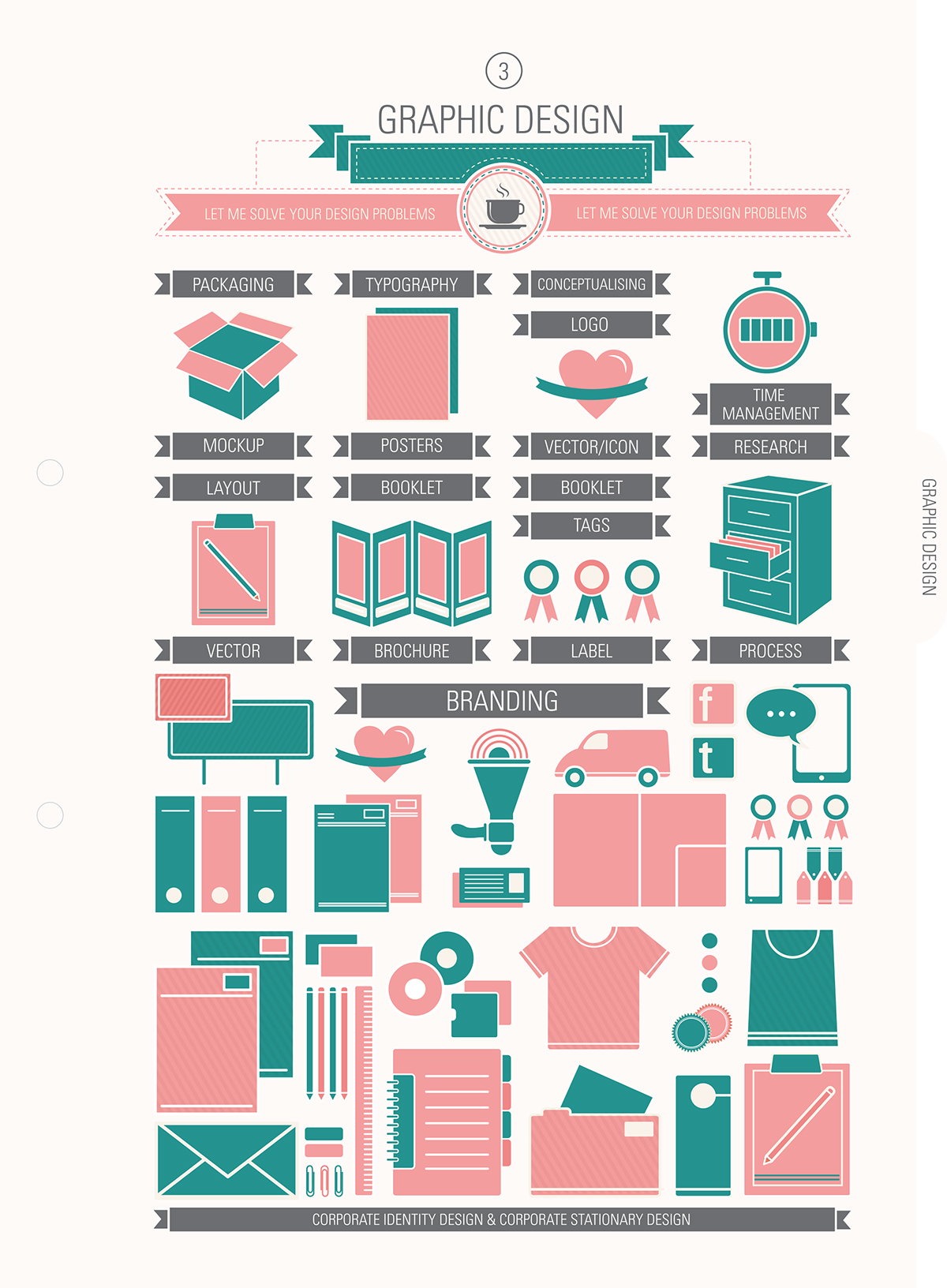
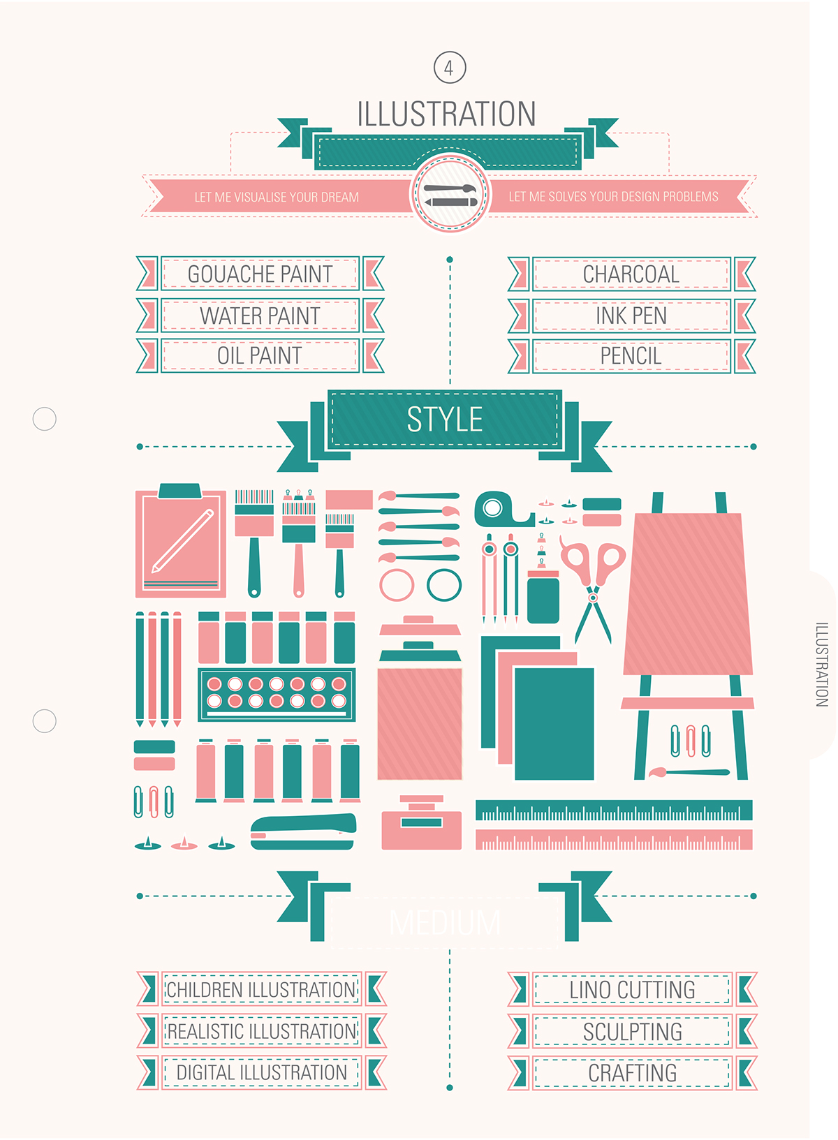
Illustration Infographic
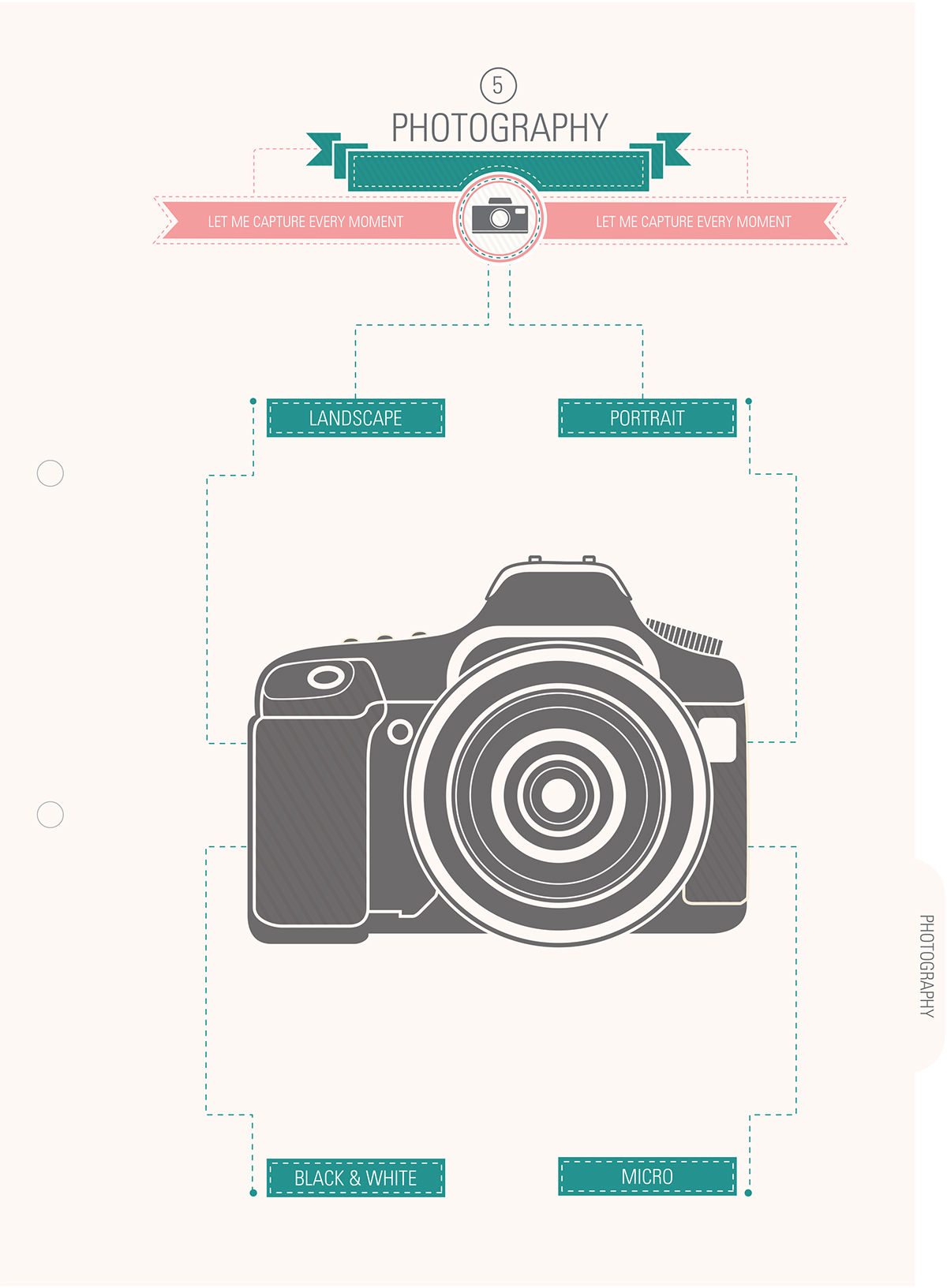
Photography Infographic
Contact details

Business card

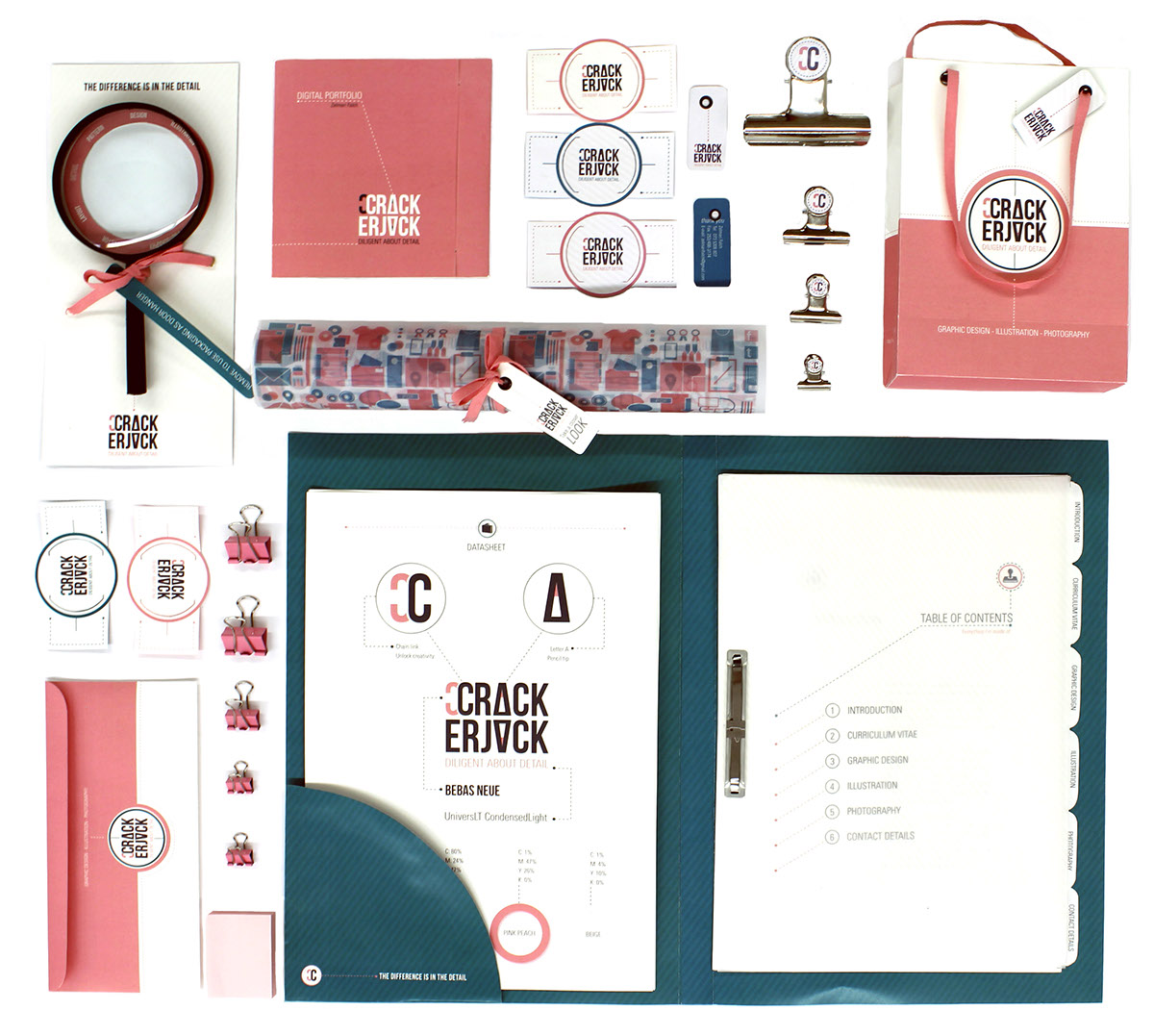
Magnifying glass and Door hanger packaging


